Quick Answer
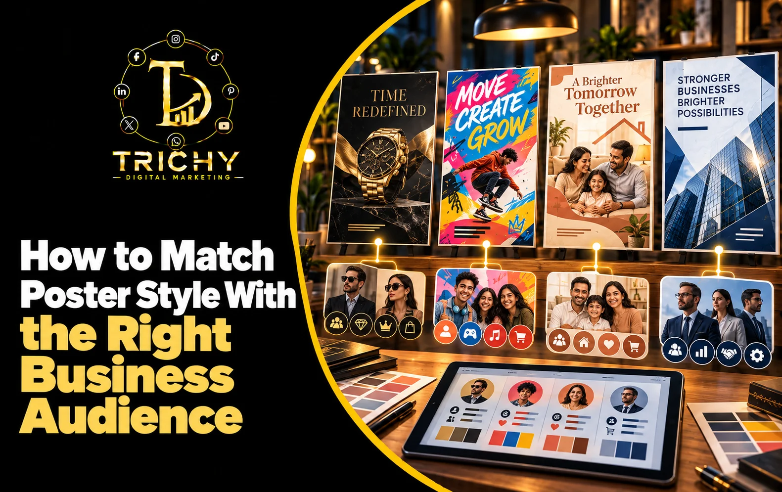
Poster design should match the audience's expectations, needs, age group, buying behaviour, and perception of the business. A professional service may need a trustworthy and structured visual style, while a fashion, food, or entertainment brand may benefit from a more expressive approach. The right style makes the message feel relevant before customers even read the details.
Introduction
A poster can be technically well-designed and still fail to connect with the people it was created for. One major reason is a mismatch between the visual style and the intended audience. A design that works for college students may feel inappropriate for a corporate audience, while a highly formal poster may struggle to attract attention in a fashion or entertainment campaign. Customers interpret colours, imagery, typography, photography, tone, and visual complexity based on their expectations of a particular business and situation. This means poster creation should begin with an understanding of who the audience is, not simply what the business wants to say. Effective poster design for target audience requires designers and businesses to consider customer characteristics, purchase motivation, trust expectations, communication habits, and the emotional response the campaign should create. When these factors are aligned, the poster feels relevant instead of simply looking attractive.
What Is Poster Design for Target Audience and Why Does It Matter?
Poster design for target audience means creating visual communication specifically around the people a business wants to reach.
The same message can require completely different creative treatment depending on the audience.
For example, consider the message:
“Join Our Digital Marketing Course.”
For college students, the poster could emphasise:
-
Career opportunities
-
Practical learning
-
Modern visual elements
-
Short, energetic copy
-
Mobile-friendly presentation
For business owners, the same service could emphasise:
-
Business growth
-
Lead generation
-
Practical outcomes
-
Professional credibility
-
Consultation or enquiry
The service has not changed.
The audience has.
Therefore, the creative direction should change accordingly.
Audience-focused design is not about making assumptions based only on age or gender. It involves understanding what the customer expects to see, what motivates them, what concerns them, and what kind of visual communication they are likely to trust.
Key Factors to Consider Before Choosing a Poster Style
Audience Age and Life Stage
Age can influence visual preferences, but it should not be treated as the only deciding factor.
A student-focused campaign may tolerate more energetic typography and expressive graphics, while a financial service aimed at established professionals may require greater restraint.
The important question is:
What visual language feels appropriate to this audience and context?
Customer Intent
A person looking for a luxury product is thinking differently from someone searching for a discount.
Similarly, someone attending an event is not necessarily looking for the same information as someone comparing service providers.
Identify whether the audience is primarily seeking:
-
Information
-
Price
-
Convenience
-
Trust
-
Status
-
Experience
-
Speed
-
Expertise
-
Inspiration
The poster style should support that motivation.
Buying Decision
Some purchases are quick and emotional.
Others require research and trust.
An impulse-driven retail promotion may use bold visual treatment, while a professional consultancy may need a more structured presentation that communicates credibility.
Customer Expectations
Every industry develops visual expectations.
A healthcare poster may need to feel reassuring.
A premium interior-design brand may need to feel sophisticated.
A children's education campaign may need to feel approachable.
A technology business may benefit from a contemporary visual language.
Breaking industry conventions can be effective, but doing so intentionally is important.
Major Poster Styles and When They Work
Minimal and Professional
This style uses restrained colours, clean typography, strong spacing, and limited decorative elements.
It can work well for:
-
Corporate services
-
Consulting firms
-
Financial businesses
-
Technology companies
-
Professional training
-
B2B services
Its strength is clarity and credibility.
Bold and Promotional
This approach uses stronger contrast, prominent offers, larger typography, and attention-grabbing visual treatment.
It can suit:
-
Retail promotions
-
Food offers
-
Seasonal sales
-
Limited-time campaigns
-
Local store promotions
The goal is rapid recognition rather than detailed explanation.
Premium and Elegant
Premium design often relies on controlled typography, refined imagery, restrained colour palettes, and generous space.
It may suit:
-
Jewellery
-
Luxury interiors
-
High-end hospitality
-
Premium automobiles
-
Boutique brands
The design should communicate perceived value rather than simply displaying a high price.
Energetic and Youthful
This style may use vibrant imagery, expressive typography, dynamic compositions, and stronger visual contrast.
It can work for:
-
Youth-focused brands
-
Educational campaigns
-
Entertainment
-
Sports
-
Events
-
Social media promotions
The challenge is maintaining readability while preserving energy.
Warm and Approachable
Soft imagery, friendly typography, natural photography, and comfortable visual spacing can create a more welcoming impression.
This can suit:
-
Family businesses
-
Education
-
Hospitality
-
Local services
-
Community campaigns
The objective is to reduce distance between the business and the customer.
The A.U.D.I.E.N.C.E. Framework for Poster Style Selection
A practical way to select the right visual direction is the A.U.D.I.E.N.C.E. Framework.
A — Audience
Who exactly is expected to notice the poster?
U — User Need
What does that person actually want from the business?
D — Decision Trigger
What could make them stop, consider, or respond?
I — Industry Expectation
What visual signals does the audience already associate with this category?
E — Emotional Response
Should the poster make people feel confident, excited, curious, reassured, inspired, or motivated?
N — Necessary Information
What does the customer genuinely need to know before taking action?
C — Context
Where will the poster appear, and how much attention will the audience realistically give it?
E — Expected Action
What should the viewer do after seeing it?
This framework prevents businesses from selecting a design style simply because it looks attractive.
Poster Design Based on Different Customer Expectations
When Customers Want Trust
Use:
-
Clear information
-
Professional typography
-
Consistent branding
-
Authentic imagery
-
Restrained visual effects
This is useful for services where customers are making considered decisions.
When Customers Want Speed
Use:
-
Strong headline
-
Prominent offer
-
Short supporting information
-
High contrast
-
Clearly visible CTA
The viewer should understand the essential proposition quickly.
When Customers Want Inspiration
Use:
-
Strong imagery
-
Emotional messaging
-
Story-driven composition
-
Aspirational visual treatment
This can work particularly well for lifestyle, travel, fashion, interiors, and experience-based businesses.
When Customers Want Value
Make the practical benefit immediately visible.
A discount, package, feature, comparison, or specific customer benefit may deserve more prominence than decorative branding.
Customer-Focused Visual Design: Start With the Customer's Question
One of the easiest ways to improve poster relevance is to identify the question in the customer's mind.
For a restaurant:
“What can I eat today?”
For a training institute:
“What will I learn and where can it take me?”
For a cleaning company:
“Can I trust this company with my property?”
For a real estate business:
“Is this property suitable for my needs and budget?”
For a digital marketing agency:
“Can this service actually help my business attract customers?”
The poster should visually answer the most important question instead of simply presenting everything the business wants to say.
Choosing Poster Style Based on Business Type
|
Business Type |
Suitable Direction |
Primary Communication Goal |
|
Restaurant |
Visual, energetic, appetising |
Trigger interest |
|
Fashion |
Editorial, expressive, trend-focused |
Build desire |
|
Healthcare |
Clear, calm, reassuring |
Establish confidence |
|
Education |
Informative, approachable, modern |
Encourage enquiry |
|
Finance |
Structured, professional, restrained |
Build trust |
|
Real Estate |
Premium, spacious, image-led |
Create interest |
|
Technology |
Contemporary, clean, systematic |
Communicate capability |
|
Local Retail |
Bold, direct, promotional |
Drive visits or purchases |
|
Hospitality |
Warm, aspirational, visual |
Sell the experience |
|
Professional Services |
Clean, credible, information-led |
Generate qualified enquiries |
These are starting directions, not rigid rules. A strong brand may intentionally take a different visual route.
The Same Business Can Need Different Poster Styles
Audience-focused design does not mean a business must use one visual style for every campaign.
A restaurant, for example, could use:
Festival Campaign: Colourful and celebratory
Premium Dining Campaign: Minimal and elegant
Lunch Offer: Direct and promotional
New Menu Launch: Image-led and editorial
Customer Testimonial: Warm and trust-focused
The business remains the same, but the campaign objective and audience context change.
This is why poster style selection should happen at the campaign level, not only at the brand level.
Local Application: Matching Poster Styles With Trichy Audiences
Businesses in Trichy serve audiences with different expectations across retail, education, hospitality, healthcare, professional services, food, real estate, and local commerce.
A coaching institute targeting students may need a modern, energetic creative that highlights courses, skills, outcomes, and enquiry details.
A jewellery business targeting premium buyers may require a more sophisticated presentation where product photography and perceived value dominate.
A local restaurant targeting families may benefit from warm food photography, clear offers, and approachable messaging rather than an overly corporate design.
A B2B service provider targeting business owners may need a more structured poster focused on credibility, outcomes, and a clear consultation action.
The important point is that “local audience” is not one single audience.
A business should identify the specific customer segment within Trichy before deciding how the poster should look.
Realistic Scenarios
Scenario 1: Training Institute
Suppose a training institute wants to attract college students.
A highly formal corporate poster may communicate seriousness but fail to create enough interest.
A better direction could combine:
-
Modern typography
-
Student-oriented imagery
-
Career-focused messaging
-
Short benefit statements
-
Clear enquiry CTA
The design becomes more aligned with the student's decision process.
Scenario 2: Premium Furniture Brand
A furniture business targeting customers looking for premium interiors should avoid making every poster look like a discount flyer.
Large product photography, restrained typography, material-focused imagery, and spacious composition may better communicate perceived quality.
Scenario 3: Local Restaurant Promotion
A restaurant announcing a one-day offer needs fast communication.
The customer may care more about the dish, offer, date, and ordering method than a lengthy brand story.
A bold promotional style can therefore be more effective.
Diagnosing a Style-Audience Mismatch
A poster may need a style change when customers see it but do not respond.
The Poster Looks Professional but Gets Little Attention
The design may be visually polished but too restrained for the environment in which it appears.
Review the context and attention level required.
The Poster Gets Attention but Few Enquiries
The visual style may attract people without communicating the value or next step clearly.
Review the message and CTA.
The Poster Looks Attractive but Does Not Feel Relevant
The imagery or tone may not reflect the customer's situation.
Review whether the creative shows the audience's actual needs rather than simply presenting the business.
Different Campaigns Feel Like Different Brands
Too much experimentation can create inconsistency.
Identify a set of brand elements that remain consistent while allowing campaign-level variation.
Common Mistakes in Poster Style Selection
Choosing a Style Because It Is Trending
A popular visual trend may not suit the business, audience, or communication objective.
Designing for the Business Instead of the Customer
Businesses often highlight everything they offer instead of showing what the customer actually cares about.
Assuming One Style Works Everywhere
A social media campaign, storefront poster, event poster, and corporate announcement may require different communication approaches.
Overusing Industry Conventions
Following category conventions can build familiarity, but copying competitors too closely can make a brand forgettable.
Confusing Attractive With Relevant
A visually impressive poster can still be ineffective if its tone does not match the audience.
Changing the Brand Every Time
Audience adaptation should not eliminate brand recognition. The campaign can change while core identity elements remain consistent.
Best Practices / Action Checklist
Before approving a poster style, ask:
-
Who is the exact audience for this campaign?
-
What does this audience care about most?
-
What decision are they being asked to make?
-
What emotional response should the poster create?
-
Does the visual tone match the customer's expectations?
-
Is the imagery relevant to the audience?
-
Does the typography suit the business category and campaign?
-
Is the offer or benefit easy to understand?
-
Does the design remain recognisable as the same brand?
-
Does the CTA match the audience's likely next step?
A useful test is to show the poster to someone who represents the intended audience and ask one question:
“What do you think this poster is asking you to do?”
If their answer does not match the campaign objective, the design may need refinement.
Key Takeaways
-
Poster design should begin with the audience rather than decoration.
-
Different customer groups respond to different visual tones and information priorities.
-
Choosing a poster style requires understanding customer intent, buying motivation, context, and expectations.
-
A business can use different campaign styles without losing its overall brand identity.
-
The best design is not necessarily the most fashionable or visually complex; it is the one that feels relevant to the intended audience.
-
Local businesses should avoid treating an entire city or market as one uniform audience.
-
Testing audience understanding can reveal whether a poster communicates the intended message.
Conclusion
The effectiveness of a poster depends not only on how attractive it looks but on whether the audience feels that the message was created for them. A student, homeowner, restaurant customer, business owner, premium buyer, and event attendee can interpret the same visual treatment very differently because their expectations and decision-making processes are different. This makes Poster Design for Target Audience an important part of campaign planning, helping businesses select the right visual tone, imagery, typography, messaging, and promotional emphasis for each customer group. For businesses in Trichy, this approach can make marketing creatives more relevant across different industries and customer segments. Trichy Digital Marketing can help businesses develop audience-led poster concepts that balance brand identity with the specific communication needs of each campaign.