Quick Answer
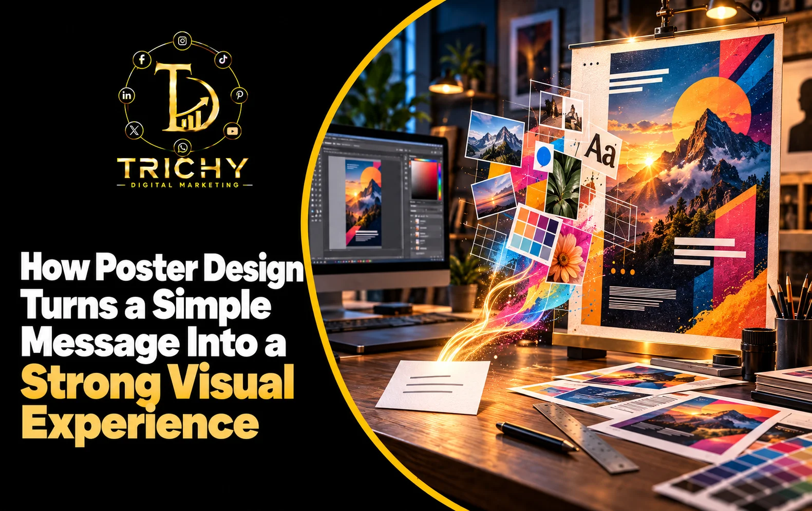
Visual communication through posters transforms a simple message by combining words, images, typography, colour, spacing and layout into one organised visual experience. Instead of making the audience read everything, effective poster design guides attention toward the most important information first, creates emotional context and makes the message easier to understand and remember.
Introduction
A poster may contain only a few words, but communicating those words effectively requires much more than placing text on a background.
Consider a simple message such as:
“Grand Opening – This Sunday.”
The information is clear, but it does not necessarily create attention.
Now imagine the same message supported by a strong headline, carefully selected imagery, clear date placement, balanced spacing, contrasting typography and an obvious call to action.
The information has not changed significantly.
The experience of receiving the information has changed.
This is the real power of poster design.
A well-designed poster does not simply display content. It determines what people notice first, what they understand next and what they remember afterwards.
For businesses using posters in advertisements, events, promotions, announcements or digital campaigns, this makes design an important part of communication rather than a decorative step added after the content has been written.
What Is Visual Communication Through Posters and Why Does It Matter?
Visual communication through posters is the process of using visual elements to communicate an idea, message, offer or piece of information in a way that audiences can quickly interpret.
A poster can communicate through several elements simultaneously:
-
Headline.
-
Typography.
-
Images.
-
Colour.
-
Shapes.
-
Icons.
-
Layout.
-
Spacing.
-
Visual contrast.
-
Call to action.
These elements do not work independently.
Their arrangement creates a hierarchy that helps the viewer understand the message.
For example, an event poster may need the audience to understand:
What is happening → When is it happening → Where is it happening → Why should I care → What should I do?
Good design can organise these answers visually.
That is why poster communication is not simply about making something attractive.
It is about making information easier to notice, process and act upon.
The Key Elements of Poster Message Design
Headline
The headline usually establishes the primary message.
It should communicate the main idea without forcing the audience to search through the design.
A strong headline can answer:
What is this about?
Examples:
-
New Collection
-
Free Workshop
-
Weekend Offer
-
Now Hiring
-
Business Launch
-
Open House
The wording and visual treatment should work together.
Supporting Information
Secondary information provides context.
This might include:
-
Date.
-
Time.
-
Location.
-
Product details.
-
Benefits.
-
Contact information.
-
Terms.
The challenge is to include enough information without competing with the main message.
Imagery
Images can establish context faster than paragraphs.
A restaurant poster might use food photography.
A real estate poster might use property imagery.
A training event might use an image representing learning or professional development.
The image should support the message rather than simply fill empty space.
Typography
Typography controls both readability and personality.
A poster can use typography to distinguish:
-
Main message.
-
Supporting information.
-
Important numbers.
-
CTA.
-
Fine print.
Colour
Colour can separate sections, create contrast and establish visual emphasis.
The most important consideration is not how many colours are used.
It is whether the colour relationships help the audience understand the information.
Spacing
Empty space is not wasted space.
It gives important elements room to breathe and prevents different pieces of information from competing with each other.
How a Poster Guides the Viewer
People rarely examine every poster element in equal detail.
A well-structured design creates a visual path.
One practical sequence is:
Attention → Understanding → Context → Action
Attention
Something immediately catches the eye.
This could be:
-
A headline.
-
A striking image.
-
A strong colour contrast.
-
A distinctive visual element.
Understanding
The viewer quickly identifies what the poster is about.
Context
Supporting information explains the offer, event, product or announcement.
Action
The viewer understands what to do next.
For example:
“Book Your Seat”
“Call Now”
“Visit Today”
“Register Online”
This sequence transforms poster content from a collection of information into a guided communication experience.
The V.I.S.I.O.N. Framework for Effective Poster Communication
A practical way to develop stronger poster communication is the V.I.S.I.O.N. framework.
V — Visual Priority
Identify the single most important thing the audience should notice.
If everything is prominent, nothing is truly prominent.
I — Information Structure
Organise information according to importance.
Separate primary, secondary and supporting content.
S — Story Connection
Make the visual elements support the message rather than existing independently.
The image, headline and supporting information should feel connected.
I — Interpretation Ease
Ask whether someone can understand the poster without studying it for a long time.
Remove unnecessary complexity.
O — Outcome
Define what you want the viewer to do or remember after seeing the poster.
N — Natural Flow
Arrange elements so the viewer can move through the information comfortably.
This framework shifts poster design from decoration to communication.
From Information to Visual Storytelling
Visual storytelling in posters does not necessarily mean creating a complicated narrative.
A poster can tell a visual story in a few seconds.
Imagine a poster promoting a new fitness centre.
Instead of presenting:
NEW GYM
Membership Available
Modern Equipment
Call 9876543210
the design could visually establish:
Energy → Transformation → Opportunity → Action
A strong fitness image establishes the emotional context.
A short headline communicates the opportunity.
A supporting line explains the offer.
The CTA tells the viewer what to do.
The information is still concise, but the visual arrangement gives it meaning and direction.
This is how a poster can turn information into an experience.
Poster Content Presentation: What Should Come First?
A useful poster content hierarchy is:
Level 1 — Main Message
What absolutely needs to be noticed?
Level 2 — Supporting Promise
Why should the audience care?
Level 3 — Essential Details
What information is necessary to understand the offer?
Level 4 — Action
What should the audience do?
Level 5 — Supporting Information
What additional information is useful but not central?
This prevents a common problem: attempting to give every piece of information equal visual importance.
A poster is not a webpage.
The audience should not have to navigate through several paragraphs to discover the main point.
How Different Poster Types Need Different Communication Styles
Not every poster should communicate in the same way.
|
Poster type |
Main communication priority |
|
Promotional poster |
Offer + benefit + action |
|
Event poster |
Event identity + date + location |
|
Product poster |
Product + value + visual appeal |
|
Awareness poster |
Issue + emotional connection + takeaway |
|
Recruitment poster |
Opportunity + role + requirements + action |
|
Educational poster |
Information hierarchy + clarity |
|
Announcement poster |
News + essential details |
|
Brand campaign poster |
Idea + emotion + brand association |
The design should follow the communication objective.
A recruitment poster should not be structured like a festival sale poster.
An awareness campaign may need emotional storytelling, while an event announcement may prioritise date and location.
Turning a Simple Message Into a Strong Visual Experience
Consider the basic message:
“Digital Marketing Workshop – Saturday – Register Now.”
That is useful information, but it is not yet a complete communication experience.
The designer can transform it by establishing:
1. A visual focal point
Make the workshop concept immediately noticeable.
2. A meaningful headline
Give the event a clear identity rather than presenting only administrative information.
3. A supporting visual
Use imagery or graphics that reinforce the subject.
4. Information hierarchy
Make the date, location and CTA easy to locate.
5. Consistent visual language
Ensure the colours, typography and graphics support the intended audience.
6. A clear action
The audience should know exactly how to register.
The message has not necessarily become longer.
It has become better organised and easier to experience.
Local Application: Poster Communication for Trichy Businesses
Businesses in Trichy use posters for many different purposes:
-
Retail promotions.
-
Restaurant offers.
-
Educational programmes.
-
Real estate campaigns.
-
Local events.
-
Recruitment.
-
Service promotions.
-
Festival campaigns.
-
Product launches.
-
Community announcements.
The local context can influence the communication strategy.
For example, a poster promoting a local event may need a strong emphasis on:
Event name + date + venue + local relevance + registration
A retail promotion may instead prioritise:
Product + offer + validity + store information + CTA
A professional service business may require:
Problem + service + benefit + credibility + enquiry action
The location itself does not determine the design.
The audience, message and desired action should determine it.
Realistic Scenarios
Scenario 1: Restaurant Promotion
A restaurant wants to announce a weekend family offer.
Weak approach:
Weekend Offer
20% Discount
Saturday & Sunday
Visit Us
A stronger communication approach can establish:
Family Weekend Feast
followed by an appetising visual, a concise offer explanation, validity details and a clear booking CTA.
The viewer understands the offer and its context more quickly.
Scenario 2: Training Institute
A training institute wants to promote a new course.
Instead of filling the poster with:
-
Course syllabus.
-
Trainer biography.
-
Class schedule.
-
Facilities.
-
Multiple paragraphs.
the design can establish:
Course → Outcome → Key benefit → Date → Enrolment action
Detailed information can then be provided through the appropriate next step.
Scenario 3: Local Retail Business
A clothing store wants to announce a new collection.
The strongest visual may not be a large paragraph describing the products.
The product itself can become the visual hero, while the design communicates:
New Collection → Style proposition → Availability → Store/Contact CTA
The product becomes part of the storytelling.
Common Poster Design Problems and Their Solutions
Too Much Text
Problem: The viewer cannot identify the main message quickly.
Solution: Remove low-priority information and create a clear hierarchy.
Too Many Visual Elements
Problem: Images, icons, shapes and text compete for attention.
Solution: Establish one dominant focal point.
Weak Headline
Problem: The poster looks attractive but the message is unclear.
Solution: Rewrite the headline around the main communication objective.
Poor Contrast
Problem: Important information becomes difficult to read.
Solution: Improve contrast between text and background.
No Clear CTA
Problem: The audience understands the offer but does not know what to do.
Solution: Add one obvious next action.
Everything Looks Equally Important
Problem: There is no visual hierarchy.
Solution: Establish clear primary, secondary and supporting levels.
Decorative Design With No Purpose
Problem: Visual elements look attractive but do not contribute to the message.
Solution: Remove elements that do not support understanding, emotion or action.
Common Mistakes and What to Avoid
Treating Every Poster Like an Advertisement
Some posters need to inform rather than sell.
The communication objective should determine the structure.
Writing the Poster Before Defining the Main Message
Start with the communication goal, then decide what information is necessary.
Making Every Word Large
Large text everywhere removes hierarchy.
Using Images That Do Not Support the Message
A visually impressive image can still be irrelevant.
Filling Every Empty Area
Whitespace can improve comprehension and emphasis.
Adding Too Many CTAs
Multiple competing actions can create uncertainty.
Ignoring Viewing Context
A poster seen on a mobile screen may require different considerations from one displayed on a large physical board.
Designing Without Testing
A poster should be reviewed at its actual intended size and viewing context.
Best Practices / Action Checklist
Before publishing a poster, ask:
Message
-
Is the main message immediately clear?
-
Is there one primary communication objective?
-
Is the headline strong enough?
-
Has unnecessary text been removed?
Visual Hierarchy
-
Is the most important element visually dominant?
-
Can viewers distinguish primary and secondary information?
-
Is the CTA easy to find?
Design
-
Are colours supporting readability?
-
Is typography clear?
-
Does the imagery reinforce the message?
-
Is spacing balanced?
Experience
-
Can the poster be understood quickly?
-
Does the design create the intended emotion?
-
Does it work at the actual viewing size?
-
Does the viewer know what to do next?
Brand
-
Is the business identity represented consistently?
-
Is the logo used appropriately?
-
Does the poster feel connected to the wider brand?
Key Takeaways
-
Poster design is not simply about making information look attractive.
-
Visual communication through posters determines how information is noticed, understood and remembered.
-
Strong hierarchy helps viewers identify the most important message first.
-
Images should contribute meaning rather than simply decorate the design.
-
Typography, colour and spacing influence how easily information can be processed.
-
Different poster objectives require different content structures.
-
A memorable poster creates a connection between message, visual elements and intended action.
-
Effective poster communication removes unnecessary complexity rather than adding more design elements.
-
The best poster is not necessarily the most visually complicated one; it is the one that communicates its purpose clearly.
Conclusion
A simple message can remain just a piece of information, or it can become a visual experience that captures attention and creates meaning.
The difference often comes from how the message is structured.
When typography establishes hierarchy, imagery provides context, colour creates emphasis, spacing improves clarity and the layout guides the viewer naturally, a poster becomes more than a collection of words and graphics.
This is the real value of poster message design.
For businesses in Trichy, effective posters can support promotions, launches, events, recruitment campaigns, awareness initiatives and everyday marketing communication. The strongest results come when the design starts with the communication objective and builds the visual experience around it.
Trichy Digital Marketing can help businesses develop poster designs that connect the message, visual identity and intended audience into a clear communication experience.
A powerful poster does not need to say more.
It needs to make the right message easier to see, understand and remember.